
Souito: visual identity case study
Five friends. Five threads. One shared mark.
Five threads. One identity.
A case study built around a five-person origin story.
Let us take a scenario where a group of 5 friends who are film enthusiasts wanted to start a clothing business based out of movies.
The ideaIn the brand story, SOU expresses origin / sacred / god-like, while ITO means thread in Japanese. Together, SOUITO becomes the origin thread — its OG origin story — connecting five people into one shared identity.
Branding principlesSimple. Recognizable. Connected. Spacious. The system should feel intentional and cinematic without becoming crowded.
A movie-inspired clothing label born from five friends. Logo designed by @sabari.design.
The O comes first.
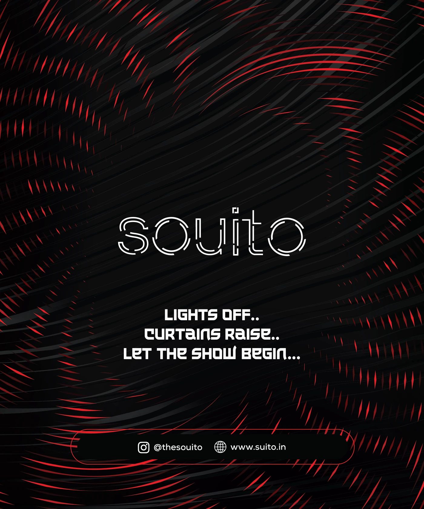
Primary symbol, wordmark and usage hierarchy.
Use the O as the hero identifier. Use the full Souito wordmark when the audience needs the name immediately. Keep the master artwork unchanged.
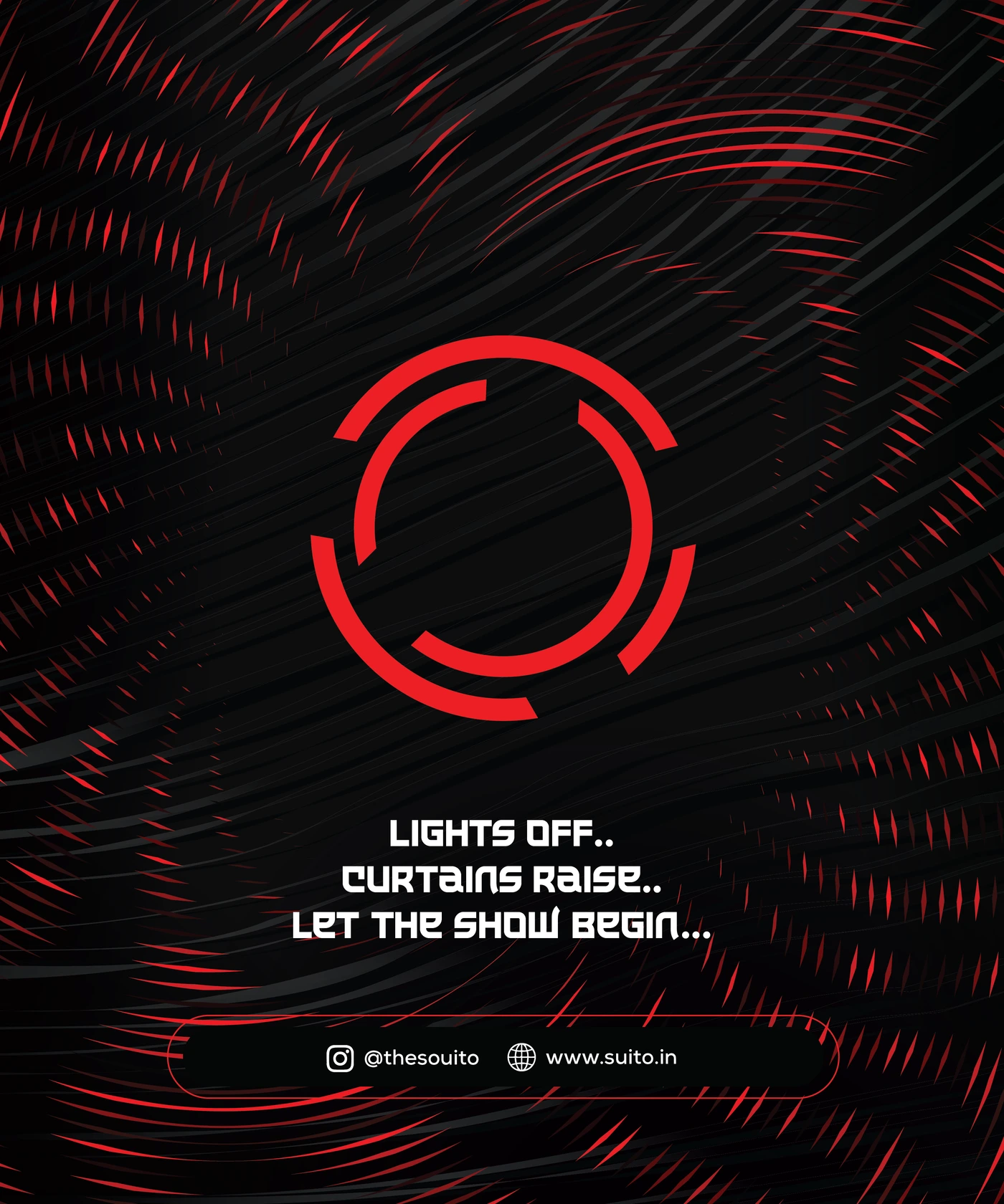
The five-thread O.
A protected symbol with a simple visual rule.
Never place text, borders, icons or imagery inside the symbol's immediate breathing room. The O remains the visual focal point.
5 Threads of Production (The Process)
- 01Concept & Screenplay: Design IdeationMapping out the cinematic theme, mood boards, and the core narrative for the apparel collection.
- 02The Blueprint: Drawing ArtifactsTranslating initial movie-inspired visions into technical sketches, blueprints, and pattern designs.
- 03The Fabric: Material & Quality ChecksSourcing premium fabrics and running rigorous durability tests to ensure top-tier wearability.
- 04The Frame: Printing & ProductionExecuting precise screen printing, embroidery, and stitching to bring the cinematic graphics to life.
- 05The Premiere: Packaging & ShippingDelivering the final wearable masterpiece from our studio straight to the customer’s doorstep.
Two inner threads, three outer. Concept and blueprint are the heart at the centre; fabric, print and delivery wrap around them and carry the idea out to the customer.
Keep a quiet zone around the O equal to the symbol's inner breathing room.
Red. Black. White.
A deliberately tight palette keeps the identity recognizable.
Red should be used as a signal rather than a fill-everywhere colour. Black carries the identity; white creates breathing room; red creates emphasis, navigation and key moments.
Application
Gang of Three leads.
Satoshi supports it: clean, modern and deliberately quiet.
DisplayGang of Three
SOUITO
ABCDEFGHIJKLMNOPQRSTUVWXYZ
0123456789
SupportingSatoshi
Satoshi isn't loaded on this page yet — the specimen above is showing a fallback face, not the real thing.
Headings are set in Gang of Three; Satoshi Variable carries labels and body copy. The custom Souito wordmark remains artwork and is never rebuilt as live text.
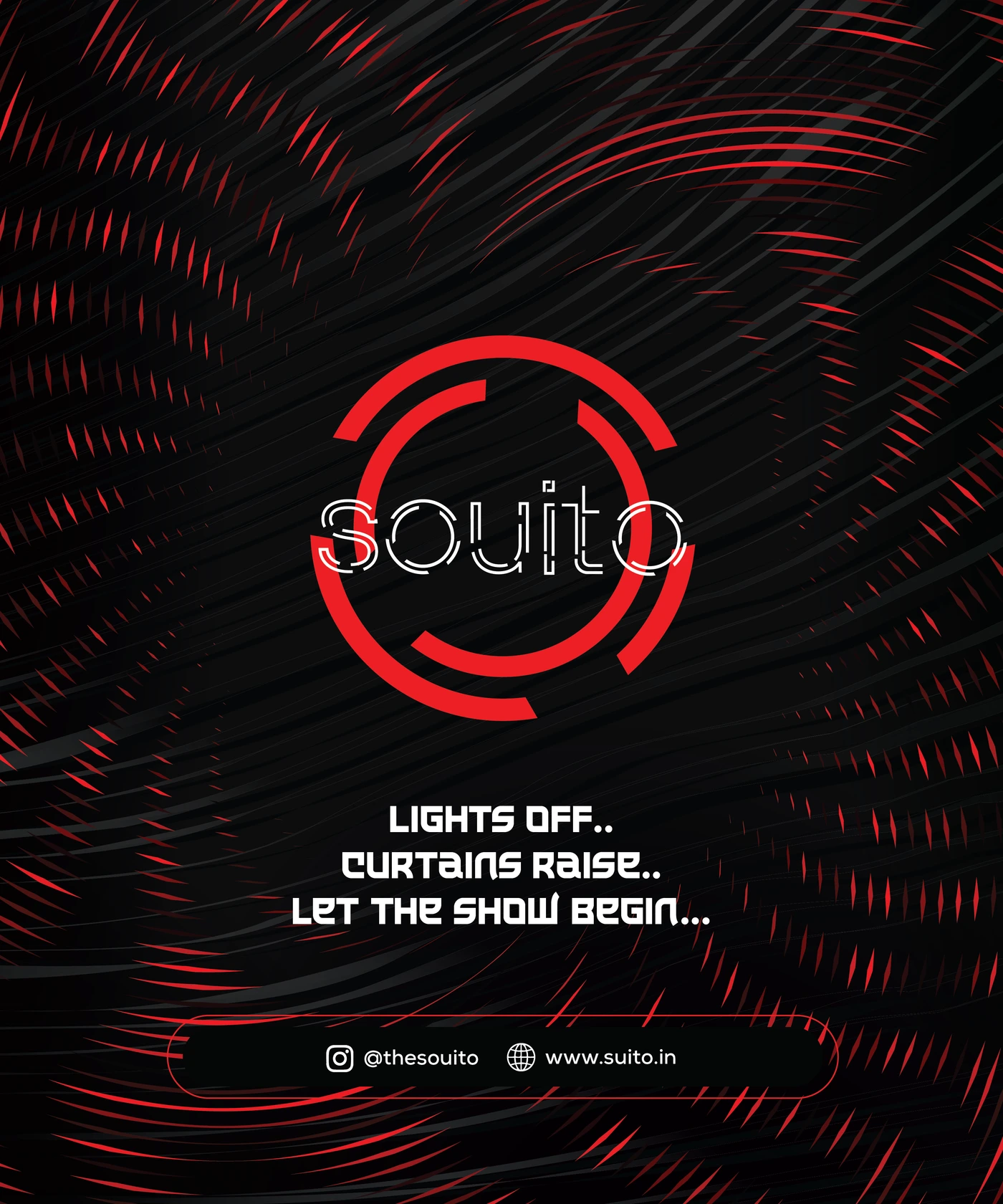
One mark, multiple surfaces.
Change the colour treatment for contrast — never the construction.
For bright or dark hero backgrounds, the Souito logo treatment should switch to white. On light surfaces, use black. Red remains the brand signal, not a default logo treatment.
Protect the geometry.
Consistency is built through spacing, contrast and restraint.
Do
Keep it clean
Use generous clear space and preserve the exact proportions of the supplied mark.
Don't
No distortion
Do not stretch, compress, redraw, outline, shadow or crowd the symbol.
The identity in motion.
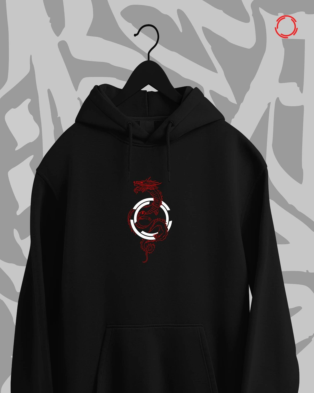
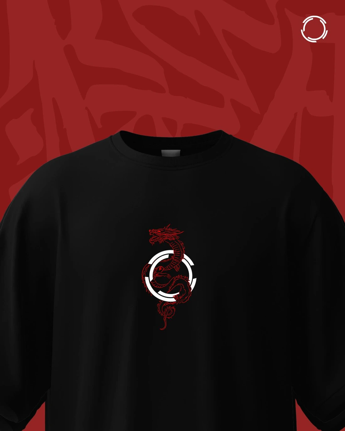
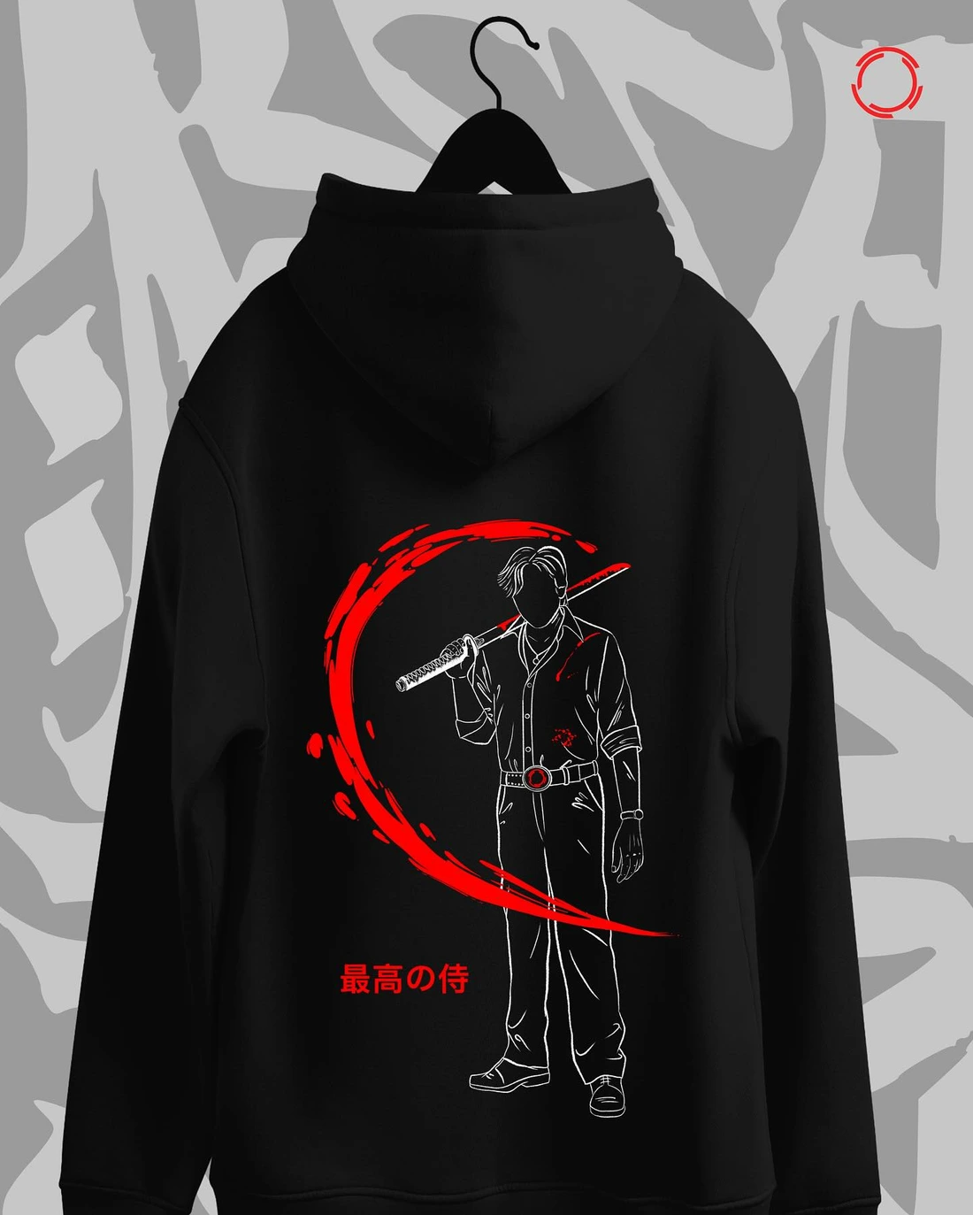
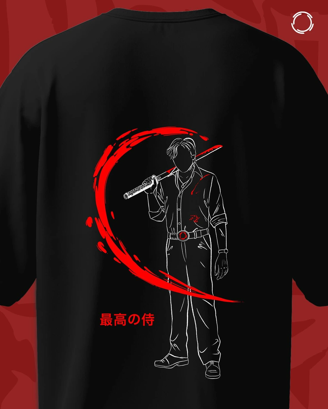
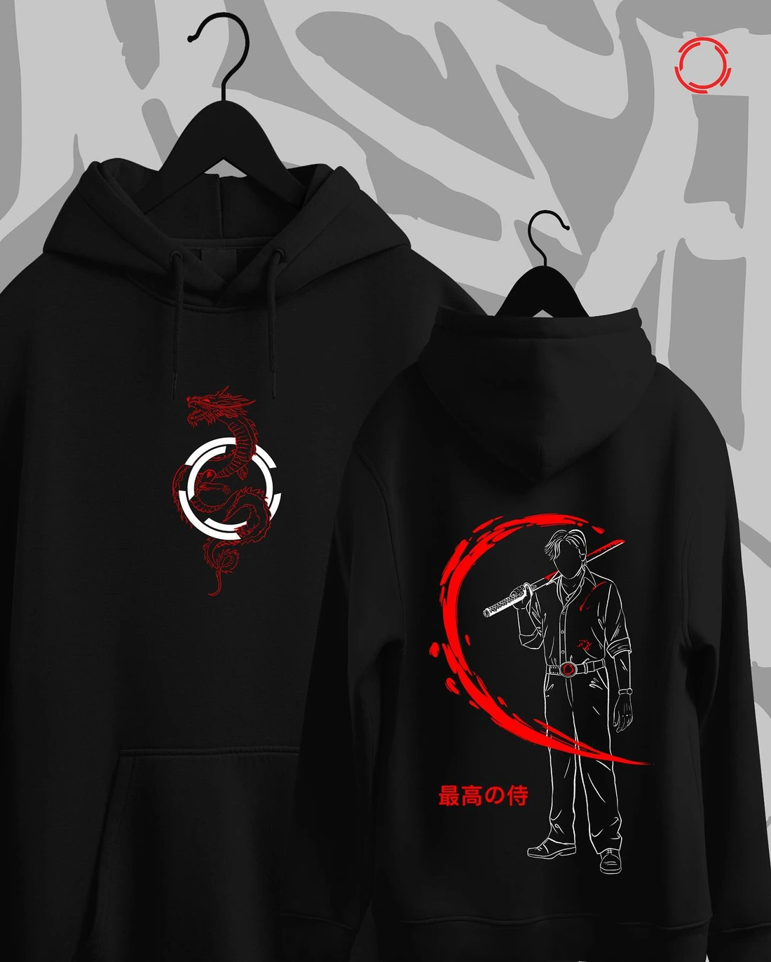
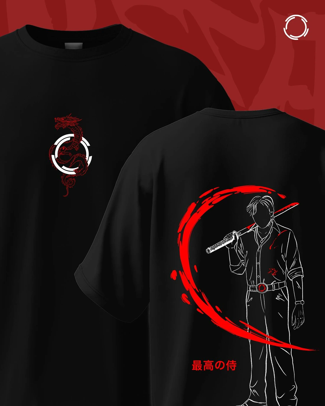
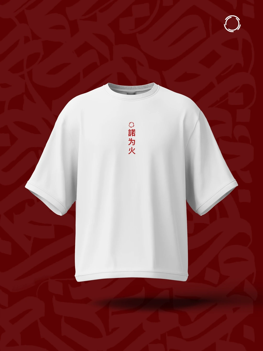
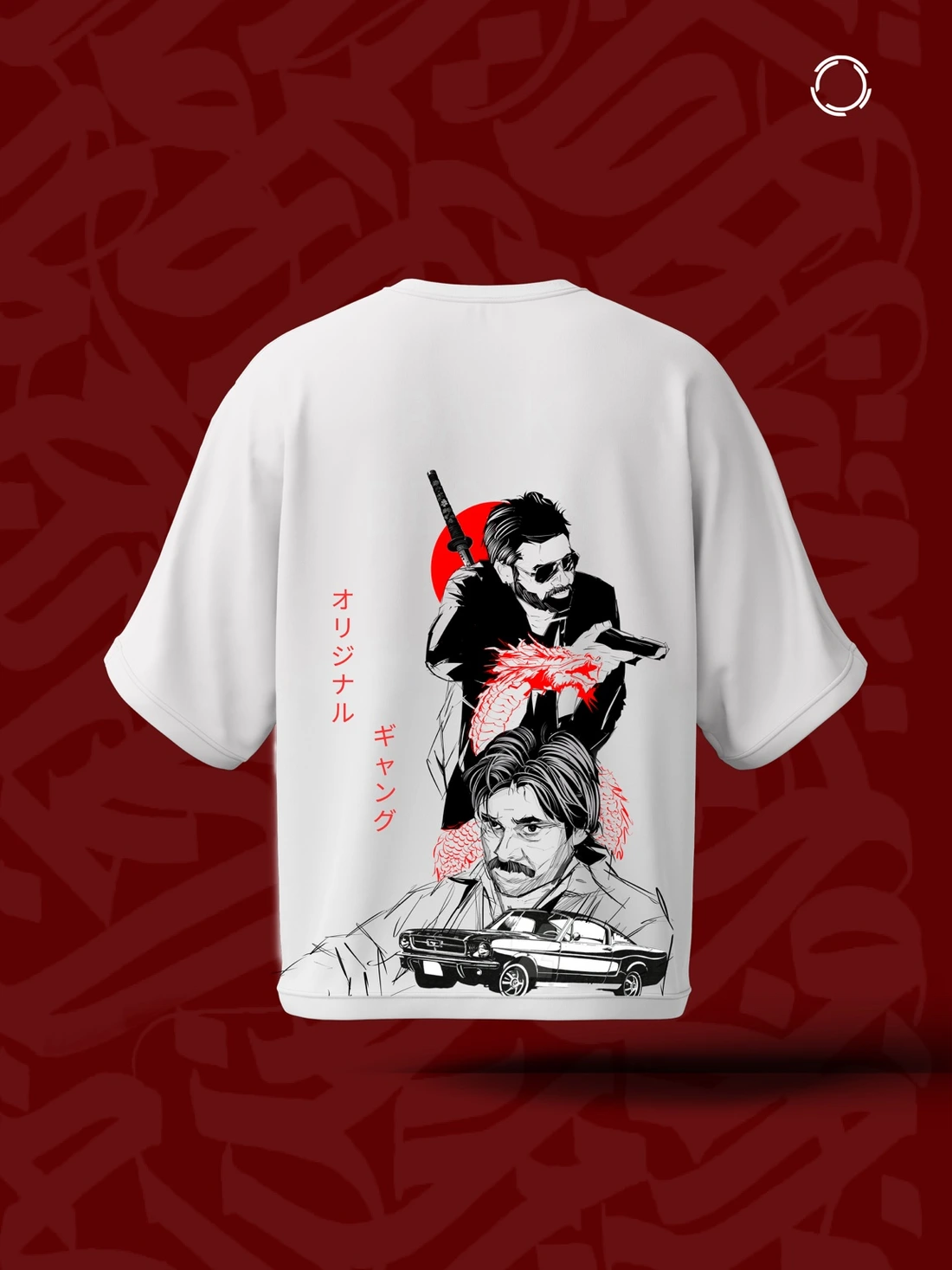
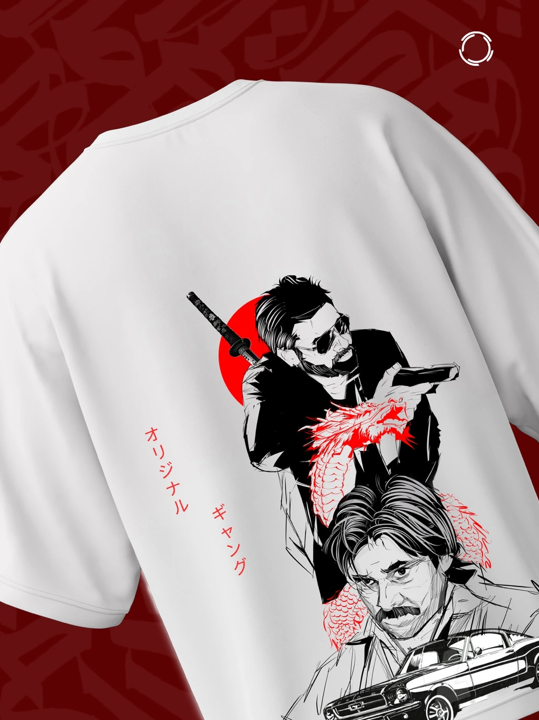
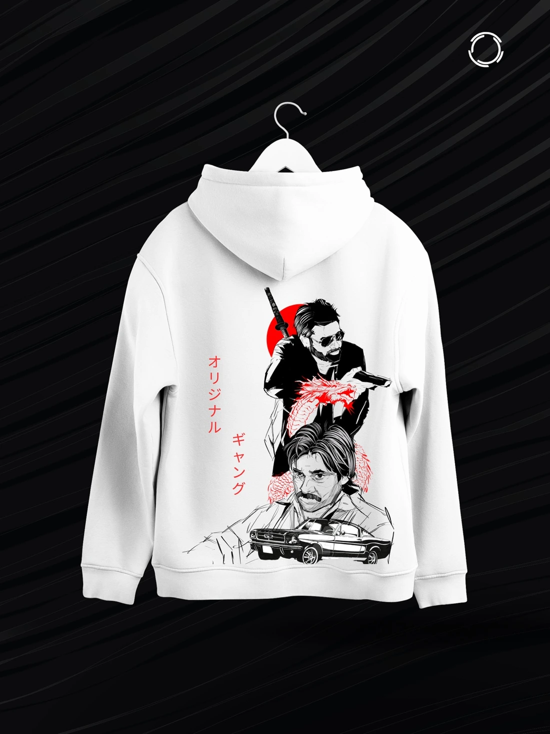
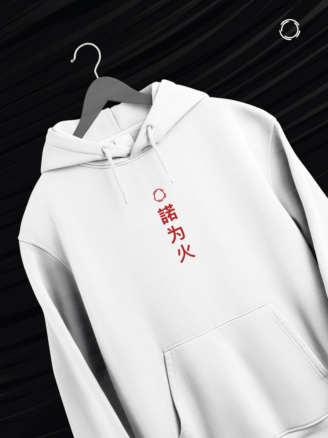
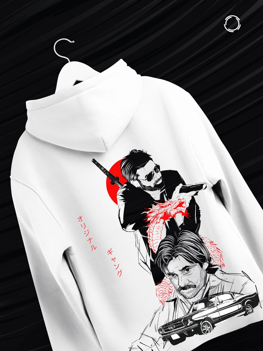
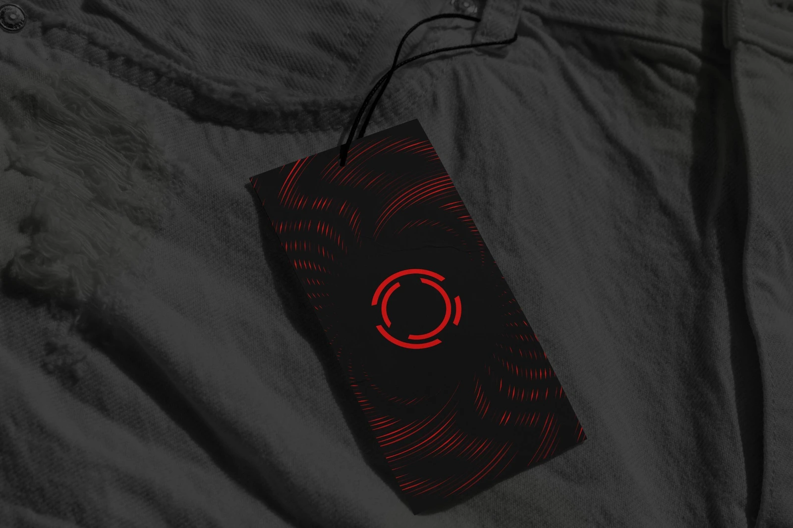
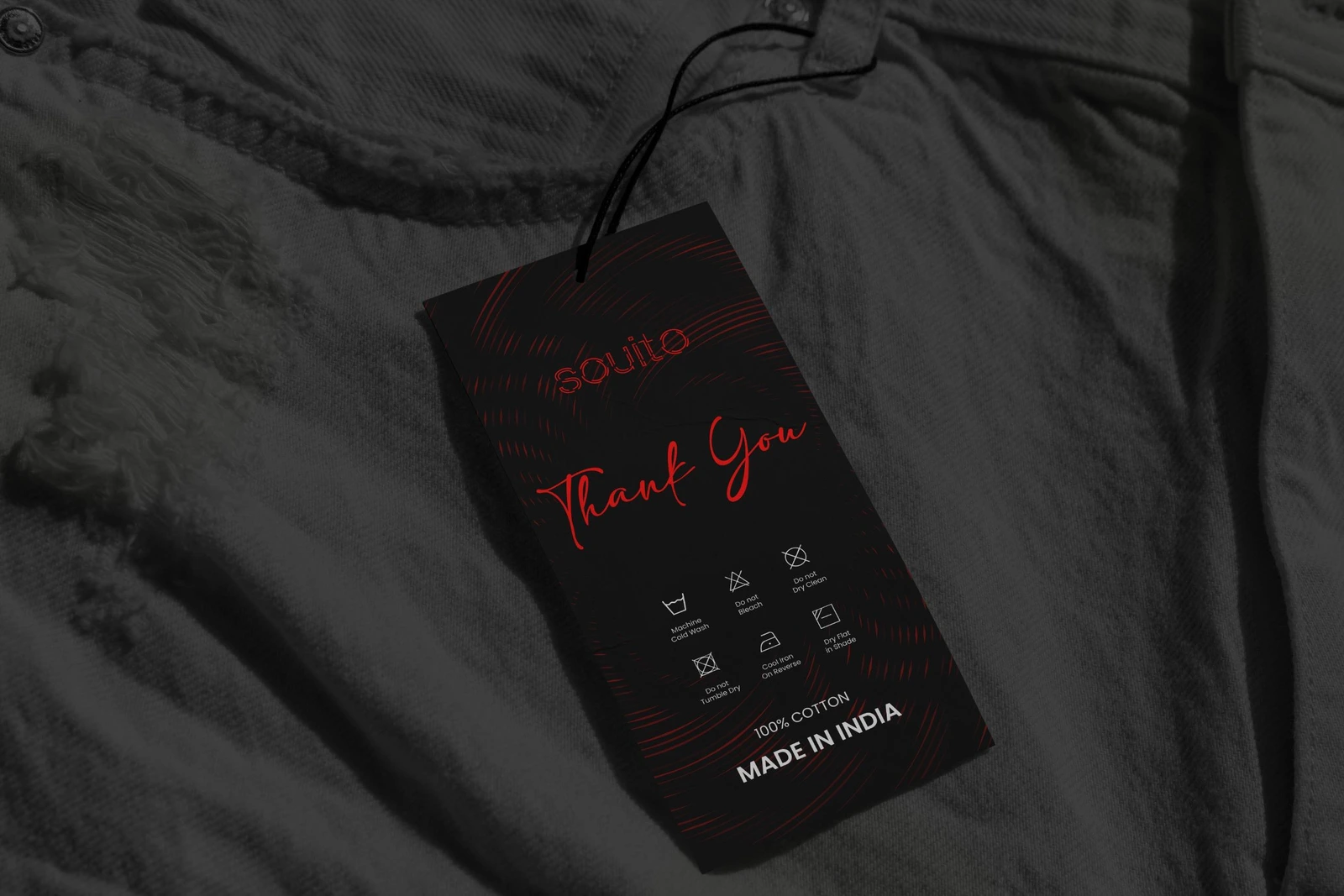
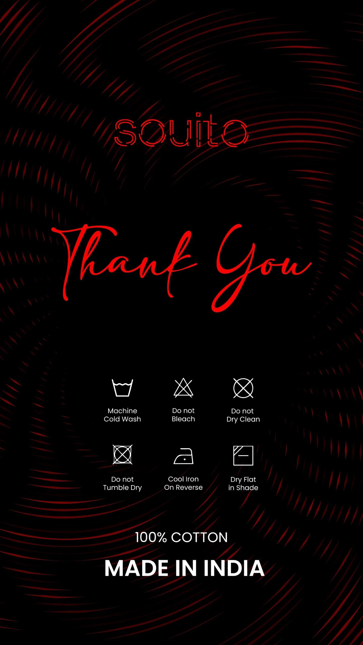
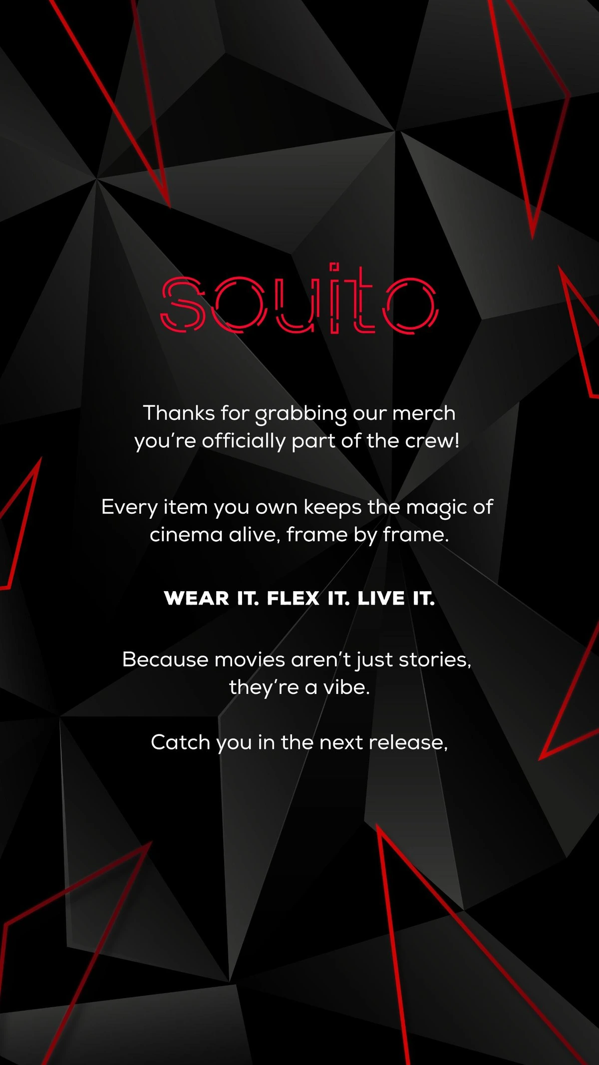
The system moves from the mark into real clothing, packaging and campaign surfaces.
Clothing
Packaging
Campaign



SOUITO, the system at a glance.
A compact summary for future brand applications.
SOUITO begins with five film enthusiasts who come together to build a movie-inspired clothing business. Five people become five threads; five threads become one shared mark.
- 01Primary symbolThe O is the hero identifier.
- 02Five threadsThe five elements represent five friends.
- 03Red / Black / WhiteRed signals; black anchors; white gives room.
- 04Contrast + spaceKeep the mark crisp, visible and unobstructed.
- 05SatoshiUse Satoshi Variable for all supporting type; keep the wordmark as artwork.
Five friends / Five threads / One shared mark